Showing posts with label photographer. Show all posts

Monday, June 29, 2015

The Relevance of a Professional Author Photo

Due to social media, an author photo connects authors with their audience now more than ever. Since these images are not only long lasting on books, but are also shared on social media outlets, isn't it worth making sure they're great? The answer ought to be an obvious: "yes!" So, why are there so many unprofessional author photos out there, when it is the one visual expression that says: "This is the person who created the work you're about to read,"?

A quality author photo is one of the most important aspects of becoming an author, and yet it often slips through the cracks. Indeed, there are some very professional, well done author photos out there, but for as many great ones, there are a plethora of faulty ones. I am not one to use clichés, but as a photographer, I completely agree that a picture does say a thousand words. I look at it this way: If an author is trying to attract readers to read the tens of thousands of words they've spent months or years writing, they should use their best author photo possible.

This is where my experience as a photographer lets me address the author photo from both sides of the lens.
If you spend months or years writing a book, spend at least a day preparing for your author photo, because it is a critical part of your brand. Here is my take on some common problems and their solutions.

Problem: Too serious of an expression.

Some authors' facial expressions are overly serious -- as though such an expression depicts intelligence and print worthiness. Yet, depending on their genre, a serious expression isn't always appropriate.

2013-12-24-BestsellingauthorJames.jpg
Photo Credit: Rankin
For James Patterson, author of Truth or Die, Zoo, and countless other books, it completely works. But, if you are a romance author, it won't work.

Solution: Genre considerations.

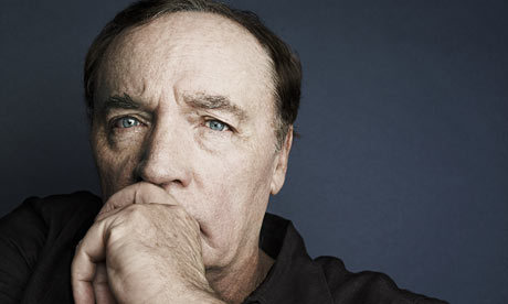
Before going into a photo shoot, consider your genre and what overall tone it depicts. If you are indeed a romance author, a pleasant expression of contentment is more acceptable than an intense and serious expression. This is one genre that the head tilted to the side and looking off into the distance, works. If you're a thriller writer, go for the intense, James Patterson-type expression. No matter what, keep your expression as natural as possible. A forced expression of any kind will be picked up by the camera.

Problem: Unflattering pose or posture.

When the camera is on you, pay attention to your body language. An author with their arms crossed will come off as defensive. Not everyone is "a natural" in front of the camera, but simple body language concepts go a long way with author photos.

Solution: Depict an inviting image. 

A simple change in position can make a big difference. For example, a person's arms crossed over their lap, while leaning into the camera, is more inviting than arms crossed over a chest and standing upright.
One common pose that works is when an author candidly places their hand on their chin or temple. This is surely an expression of thinking, which is true -- thinking about what to write next is a huge part of being an author. Be sure the look is authentic and not forced, which borders on cliché.
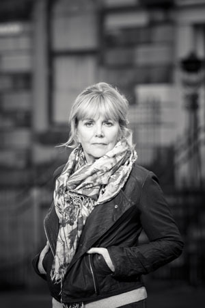
Women, as mentioned above, have the habit of tilting their head to the side, gazing at the camera or off into the distance. This does work for certain genres.

Problem: Photo processing.
 
An image that is off in tone, color, exposure and contrast/brightness, will look unprofessional. These are common problems that are usually fixable by someone who is talented with Photoshop. The ones that frighten me the most, however, are photos where the flash lights up the author's face in all the wrong areas (i.e. forehead and nose).

Solution: Hire a professional photographer. 

A professional photographer will help with not only producing a quality image, but they should also be able to assist with body language and posing.

In terms of a color versus black and white image, many old school male authors tend to lean toward black and white. This can be a great choice, and is often more flattering for those who have a few decades behind them. However, if you are a romance author, I believe your photo should be in color. If you're starting to see a trend between the relevance between genre and your author photo, give yourself a pat on the back.

Problem: Cluttered background.

The backgrounds that scream amateur are the ones with merely a white wall behind the author, or worse yet, but still a popular pick, the author standing in front of shrubbery (oops, did I just describe your own author photo?) Don't get me started on the backgrounds with too many distractions, like a plate hanging on the wall next to their head, or curtains that have busy patterns or aren't framed right in the image.

Solution: Find a background that enhances, not distracts from, your portrait. 

For the most professional results, it makes sense to hire a professional photographer. One great example is that they will know how to work with depth of field. Using "shallow depth of field" in your image will blur out your background, making you pop. "Large depth of field" keeps everything in the background in focus. A busy background, especially one that is in focus, competes with the main subject -- you!

2013-12-24-KATEATKINSONwebsitesmall.jpg

Photo Credit: Euan Myles
I love this photo of Kate Atkinson, author of Life After Life: A Novel, among others . The background is relevant and doesn't compete with, but enhances, her image.

Final thoughts: An unprofessional author photo sends the wrong message.

I realize that I have mentioned hiring a professional photographer as the solution for some of these problems. The reason is that I strongly feel that being an author is a business, and much like you would hire a CPA to do your books, you should hire a professional photographer to take care of your looks. There are several reasonably priced photographers out there who can do a great job. Don't ask a friend or family member to do it unless they have experience as a photographer.

Lastly, I recommend spending some time browsing Amazon for authors in your genre. Take notice of what their images depict, and use it to create the visual you want to send to your readers.

Note: My own author photo was captured by the talented Doug Ellis at Ribera Beach, C.A.


Saturday, December 17, 2011

Facebook's New Timeline and Why I Love It!

As of December 22nd, everyone's Facebook page will look a lot like a blog. It's the new Timeline layout and it's quite a big change compared to the last round we endured.

My Reaction
I will say right off that I LOVE the new layout. The "Cover" image at the top and the scrolling Timeline is much like the banner images and blog posts we see on people's blogs. As a photographer, I'm especially excited about this new design. As a writer, the new layout also comes in quite handy for promotional purposes.

So many people use Facebook for posting images and videos. I've been on people's walls where that's all they have - shared images and videos from other people's walls. There are days when it seems that the News Feed is filled with them. This new layout is conducive to a very visual environment, which is why I think it works so well. Posts are now side-by-side one another, unless you make a certain post a Highlighted one (see below), much like a column in a newspaper or a magazine. If you want to see a great example, check out Ann Curry's.

Here are my three top fav features for the new Timeline.

Cool Features: 

Cover Image
The new cover image, as I said above, is much like a banner picture. SO much better than the 5 thumbnails across the top that were there before and that we had no control over. With the new banner size image, there are limitless possibilities. As you can see with mine, I PhotoShopped in three pictures and added text in the upper left corner to my website...it's subtle. When visitors click on the image, I've added a short bio and a link to my website. This is just one way authors, photographers, and many other people can utilize the new features to their advantage. By the way, the perfect dimensions for a cover photo are 850x315 pixels. If your image is that size, there will be no cropping or adjusting it. Remember that your profile picture will take up a portion of the bottom left corner, too.
 
This image is the Cover for my photography buddy, Marcel Pepin. He and I have been chatting quite a bit about the advantages of a landscaped image at the top of your page and all the different things you can do with it. From making it a collage of pictures as I did (easy to do in a program like Photoshop), to including a directional link in your photo description as both Marcel and I have done, there can be subtle and even not-so-subtle uses for the banner image. Choosing your image is a personal statement, and we all know a picture says a thousand words...sometimes even more.

Life Events

I chose to update and publish my own page before the December 22nd deadline so that I'd have time to be sure the posts from 2009 that I didn't want to be reminded of were deleted. The new Timeline goes back to the beginning of your Facebook time...including highlighted posts. You can add your own "Life Events" to years going back to when you were born. Most people might add their wedding day, when they had their children, etc. but there are great possibilities for authors, too. For example, I added when both WHISPERS FROM THE HEART and WRITE FROM THE HEART were published to my Life Events (as "Other"). One thing I noticed is that the default for Life Events seemed to be "Public" so I changed mine to "Friends."

Highlight Feature
One feature I really like is the "Highlight" feature. The "Highlight" feature is the Star next to the Edit (pencil) icon in the upper right corner of a post. When you click on the Star, it makes the post spread across both sides of the Timeline - looks cool for pictures and photo albums.

Fewer Ads
Another thing I noticed that's a big plus, is that with the Timeline layout, you actually have a Timeline bar on the right side of the screen - that's where ads use to be! So, now there are fewer ads on the right.

Birthday Wishes
We all love getting Birthday Wishes, but with the new Timeline, the hundreds or thousands of Birthday Wishes you get will now be contained in one Timeline box that lets you scroll through to read them. No more will all those posts dominate your entire page!

When people start posting Happy Birthday Wishes on your wall, Facebook's Timeline bulks them all together into one Timeline box. You'll get to see the first several, and can scroll through them until you get a notice to view additional comments...As you click on, for example "78 Additional Comments" (or close to that!), it will display the next bunch - you'll have to scroll down within that box until you reach yet another notice to click to view more additional comments (however many that may be). Keep clicking and scrolling through until you eventually hit the end of all your wishes. Note that you will see the gray bar on the right side of the box (within the window) and it will scroll down as you go through the list of comments until you reach the end.
Happy Birthday!


My Christmas Wish
My only wish for Facebook is that they do the same type of layout for Fan Pages, which they seem to never change.

Ready to change your Facebook layout? Click Here to learn how.


*****
Heather Hummel is a celebrity ghostwriter and an award-winning, best-selling author. Her published works include:

Journals from the Heart Series:
Whispers from the Heart (2011)
Write from the Heart (2011)
Nonfiction
GO BIKE & Other Signs from the Universe (2011)
Gracefully: Looking and Being Your Best at Any Age (McGraw-Hill, 2008),
 Essays:
Messages of Hope and Healing ( Sunpiper Media, 2006)
Blue Ridge Anthology (Cedar Creek, 2007) with David Baldacci and Rita Mae Brown
Awards:
2009 Mature Media Awards, Merit Award
2009 New York Book Festival, Honorable Mention

Visit Heather’s website at http://www.heatherhummel.net/
Follow Heather on Twitter:
http://twitter.com/#!/HeatherHummel
"Like" Heather's Fan Page http://www.facebook.com/HeatherHummelFanPage

Visit Marcel's Photography at RedBubble